Case study · SaaS platform · Automotive services
Designing Trust Into a Vehicle Service Platform
Car owners struggle to explain what’s wrong with their vehicle, and that miscommunication breeds distrust. I designed a booking, service and payment platform where customers simply point at the car.
Role
Product designer (Contract)
Scope
Web application, user journeys, user flows, visual UI design
Status
Design delivered · development paused
Constraints
Follow the approved flow architecture; full UI freedom
Users
Customers, mechanics and shop staff
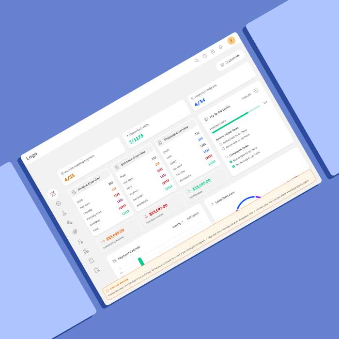
At a glance
Problem
Complex tools and customers who can’t explain the issue
Existing shop software is hard to use for clients, mechanics and staff alike — and vague problem descriptions lead to miscommunication and distrust.
What I did
Journeys per role and “point at the car”
I turned an engineering diagram into user journeys for each role, researched with mechanics and drivers, and designed visual defect reporting on a car illustration.
Outcome
A clearer platform for three types of users
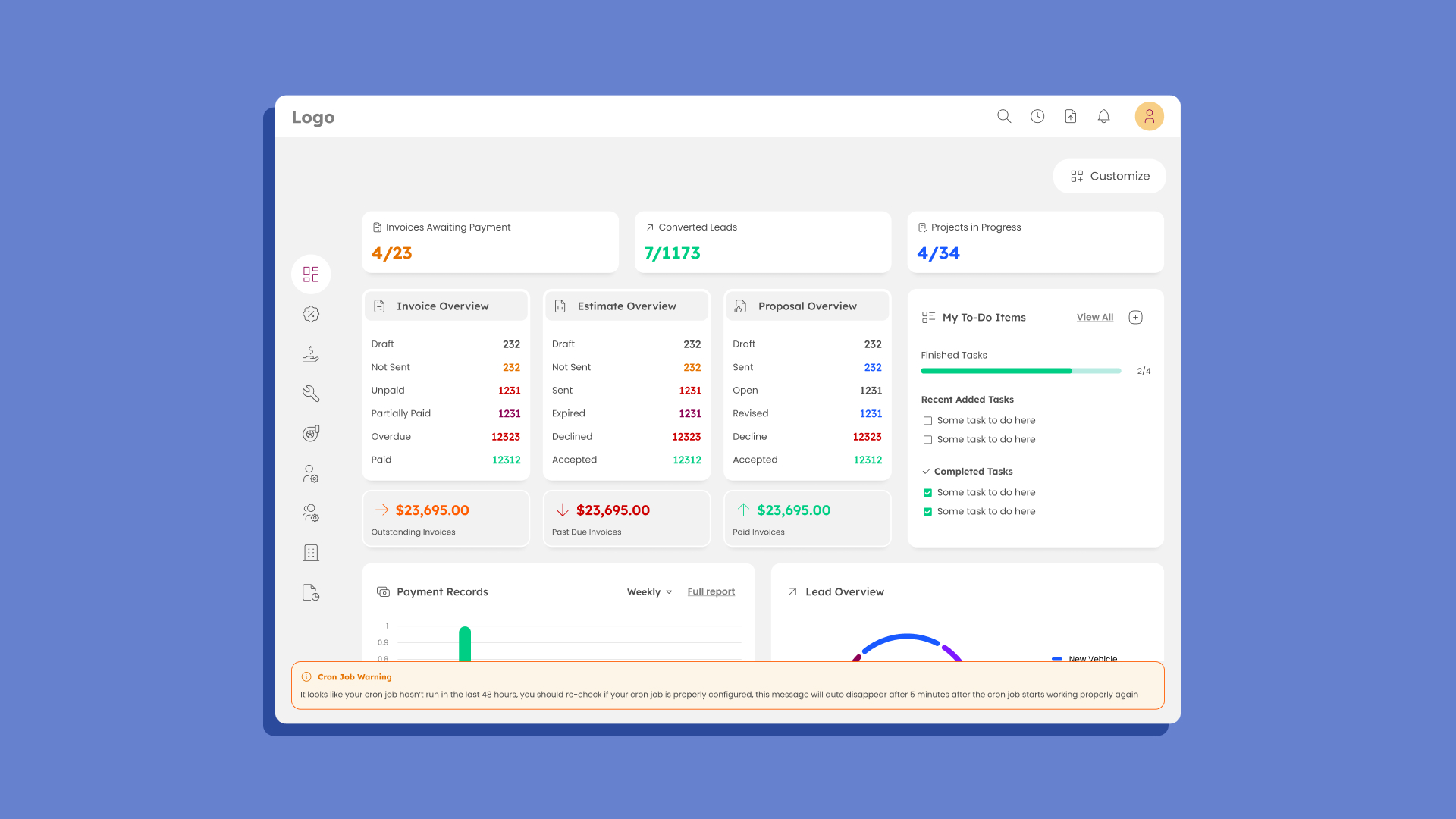
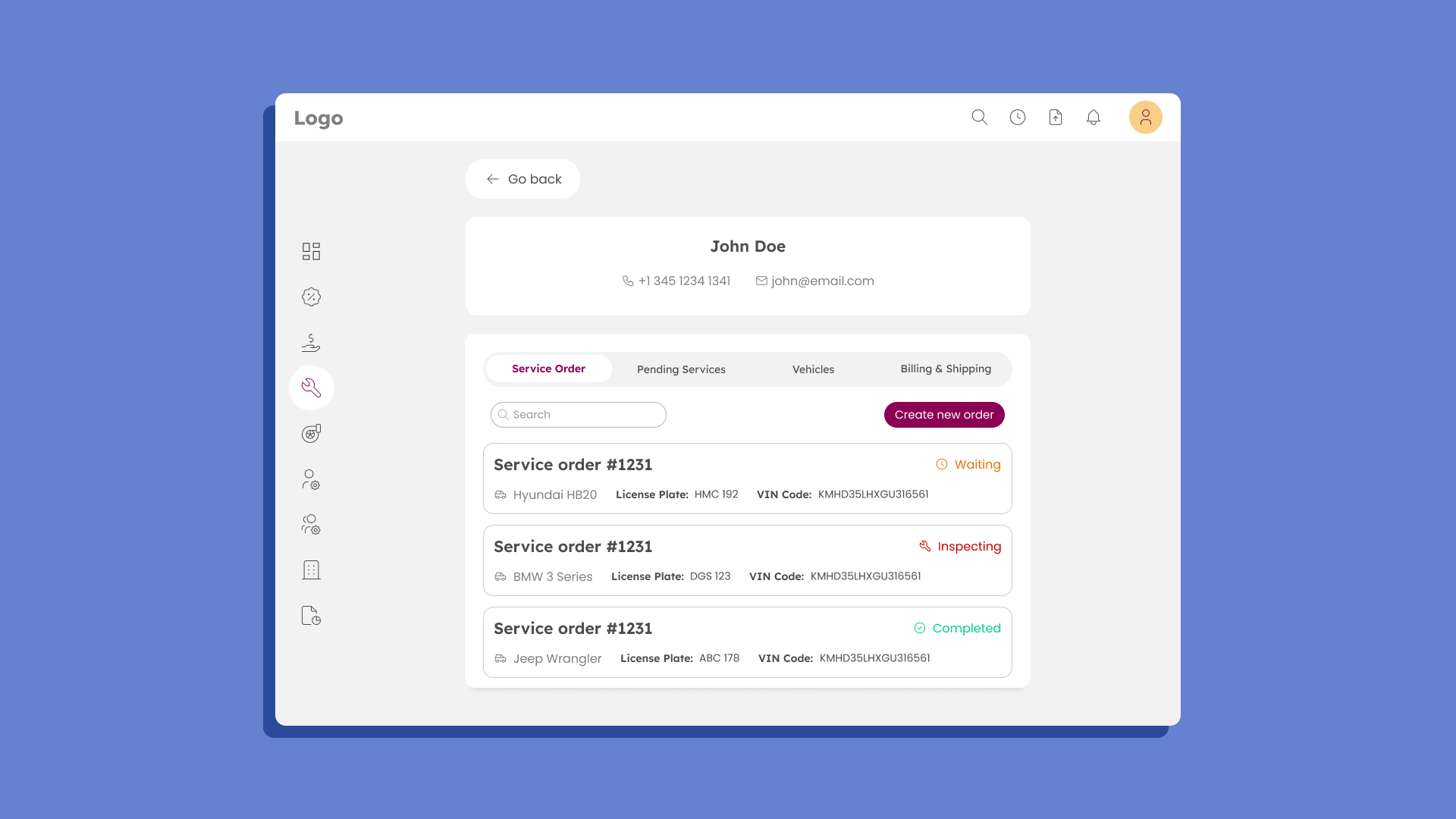
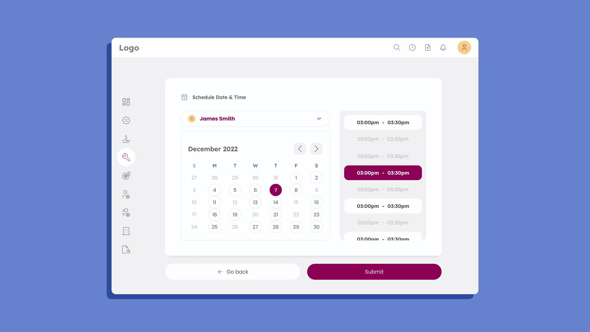
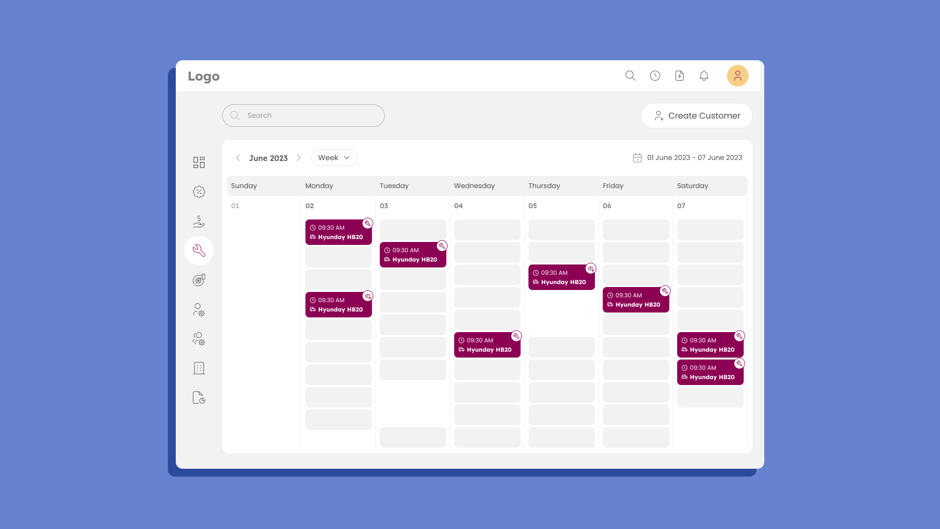
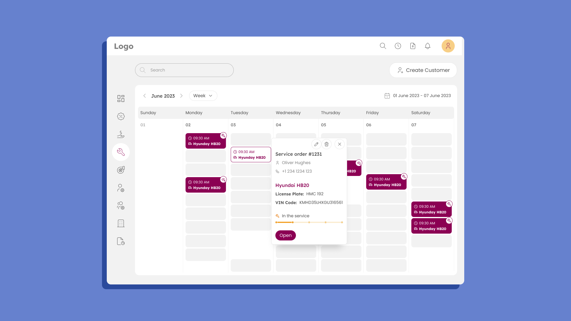
The design is complete: booking, defect reporting, service orders, scheduling and payments, with a lightweight client app. Development is paused for funding.
The problem
Software for vehicle service shops competes badly on one key aspect: usability. Existing tools offer complex functionality with interfaces that clients, mechanics and shop staff all struggle with. I joined the team to design a platform that handles booking, service and payment, with an outstanding and functional UI.
Some people know a lot about cars. Many more don’t care beyond whether the car starts — and they are the ones who usually end up at a service shop. People who lack vehicle knowledge struggle to explain or understand technical issues, which creates miscommunication with mechanics. Miscommunication leads to distrust, and distrust is bad for business.
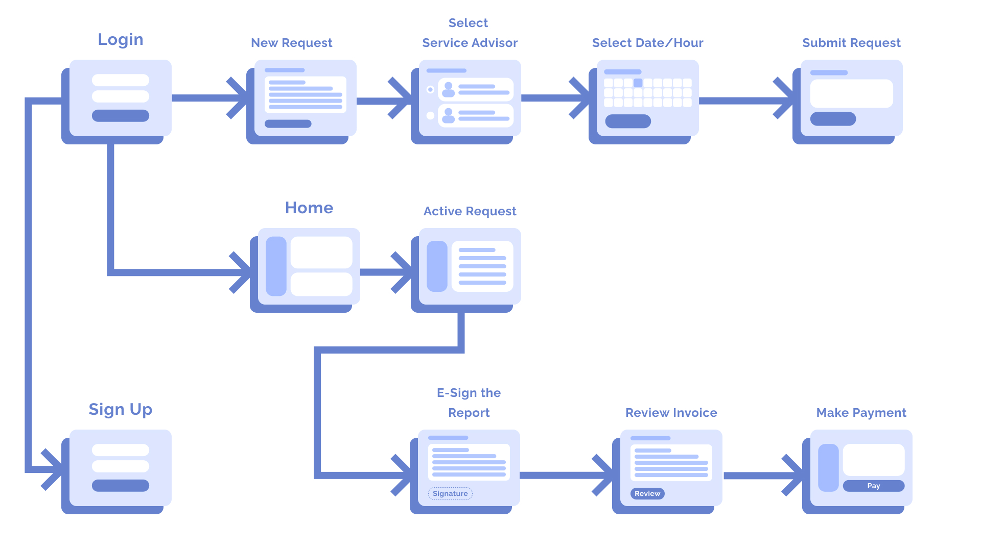
From system diagram to user journey
The project manager, a former IBM developer, introduced the project with a detailed flow diagram — an engineering artifact covering many flows, including the backend architecture. From a designer’s perspective it lacked one important detail: the user.
I translated the diagram into a simplified, journey-focused flow for each role while staying faithful to the approved architecture. The journeys helped us both understand how clients, mechanics and staff would use the app. They also showed that clients needed only a small fraction of the platform — small enough for a lightweight app in the browser or on a phone.
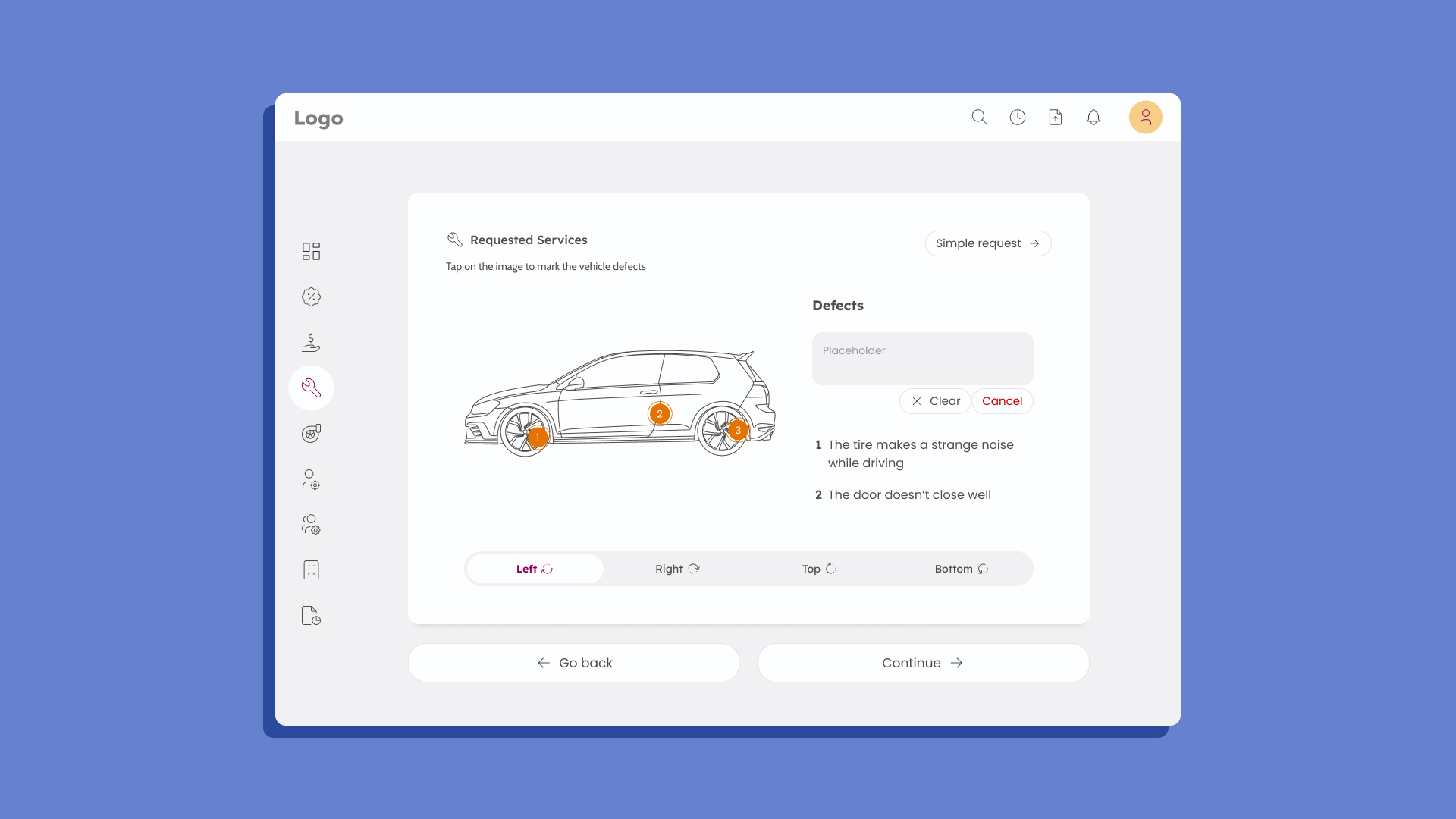
Point at the car
To tackle miscommunication, I researched local service shops and interviewed mechanics about how they handle clients who can’t explain a problem. Most check the vehicle themselves, then call the client to report the issues and let them decide whether to proceed.
I then interviewed drivers who own a car but don’t know much about vehicles. They used vague words for noises, the car’s behavior or dashboard lights. When they couldn’t explain at all, mechanics asked simple questions: “Is any light on in the dashboard?” “If not, what noise do you hear?” “Where is the noise coming from?” “How does the car behave?”
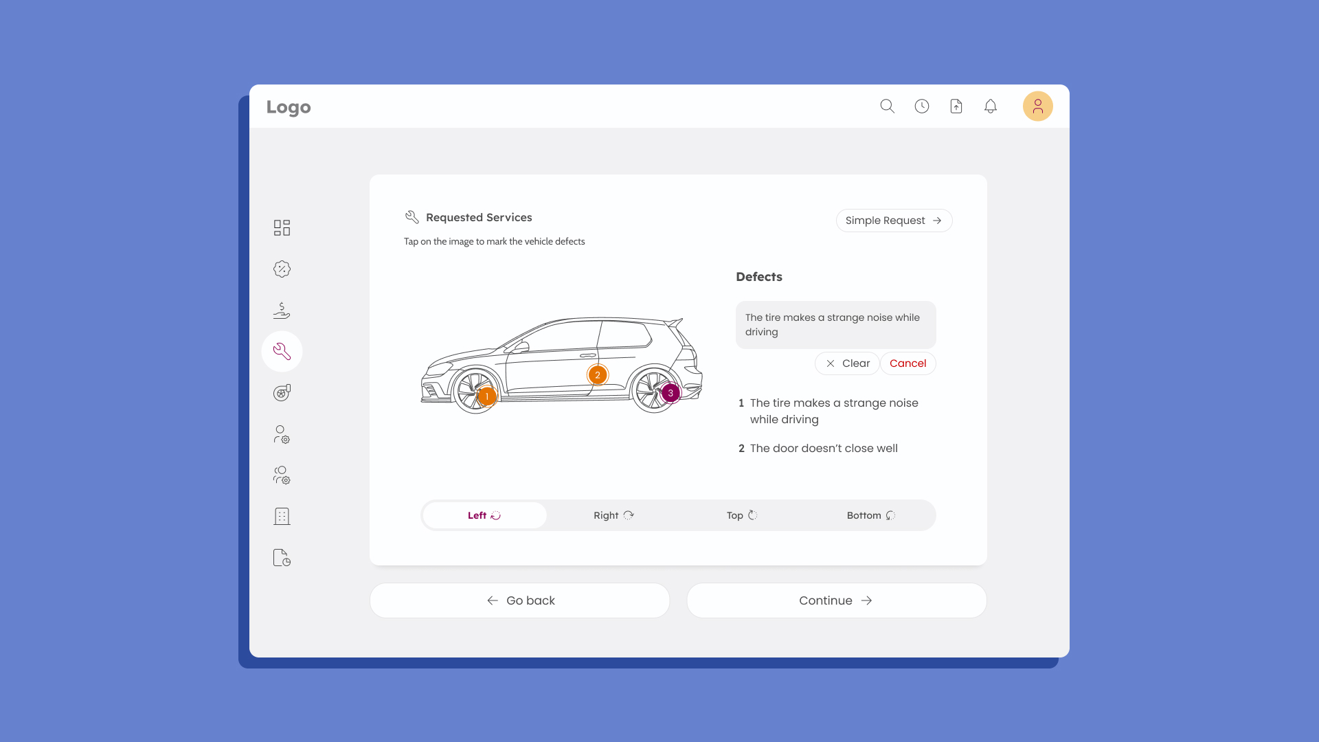
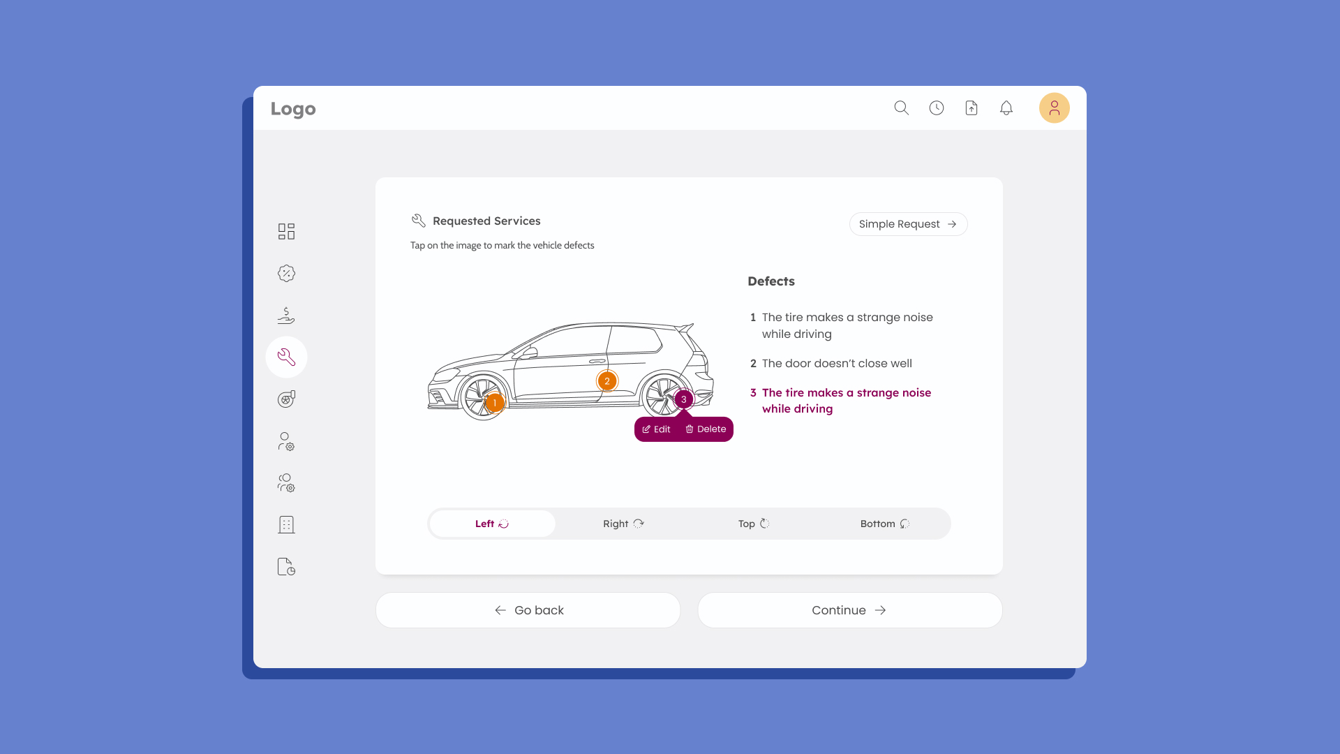
I explored prewritten questions, but questionnaires are long and users get impatient. A free text box alone was too unreliable. The solution: an illustration of the vehicle with a pin to mark where the problem is, plus a short text field to describe it. Even if the description is unclear, knowing the location helps the mechanic isolate the problem. It doesn’t replace diagnosis — mechanics have their own tools — but it narrows the search and builds trust.
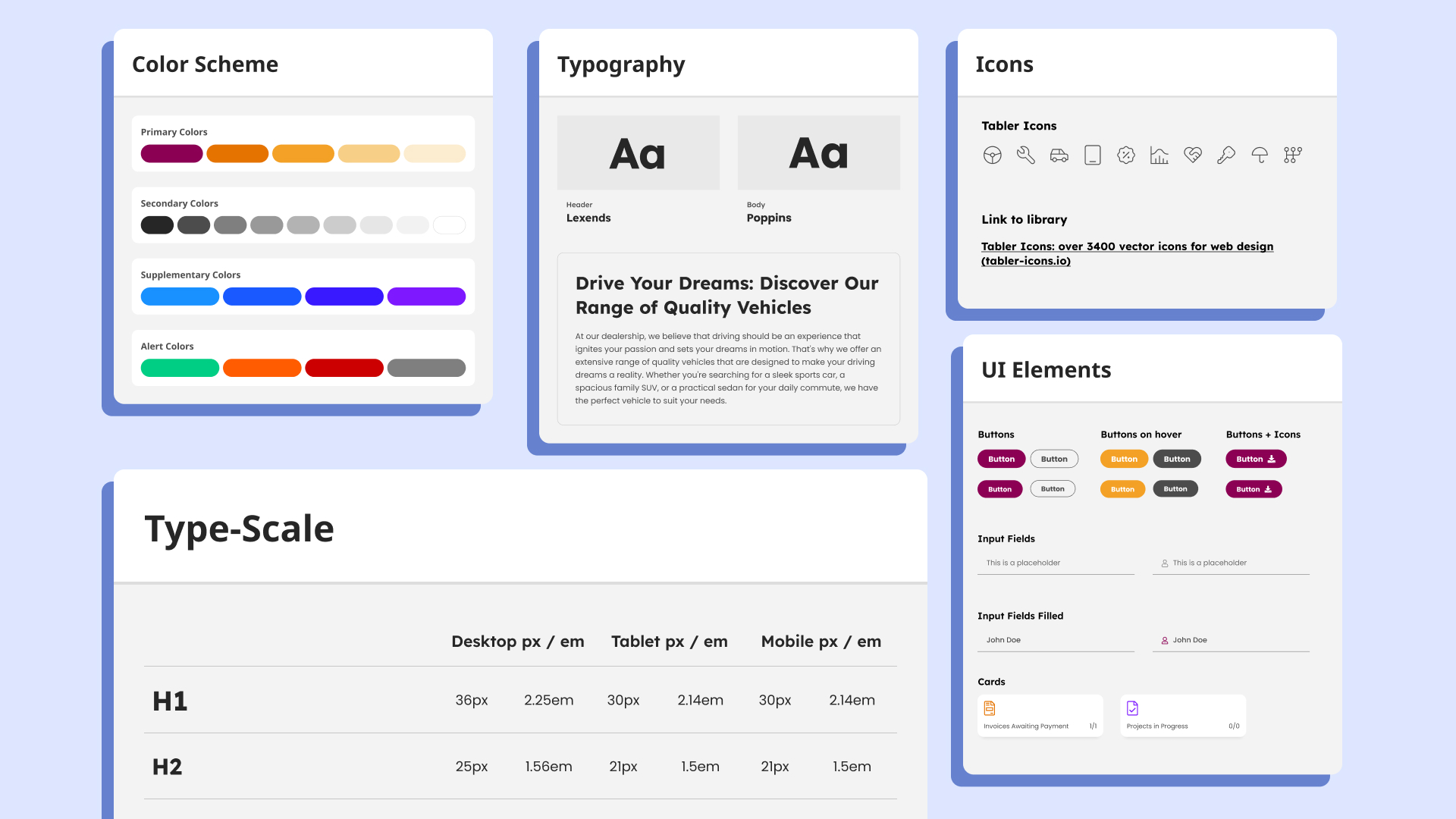
Craft, unconstrained
This was my one engagement with no component-library restriction. It called for polished, custom UI elements with intuitive usability. The biggest challenge was designing one platform for three types of users — keeping it authentic and familiar while giving it a fresh UI.
Where it stands
The design was completed and delivered. The product itself has faced funding obstacles, which are delaying development.
From spreadsheets to one automated workflow →
Have a complex product that needs to feel simple?
Tell me about it. Full case studies are available on request.