Role: Product designer (Contract)
Scope: Web Application, UX Architecture, User flow, Visual UI Design
Project Status: Under Development
Constraints: Material UI Components Library
Team: Jeffrey Hanby, John West ~Lookfar Labs
The Problem
We create a process that we believe is making our job easier, but the complexity of the practice itself is a time-consuming and difficult to delegate. Our client's manual practice mirrored a medical practice that filled out benefit applications for patients. It relied on endless Excel tabs for managing applications and ChatGPT to copy boilerplate content into each form.
Each application was a headache, requiring updates and progress status changes for each application form. Scalability was another issue. The workflow's complexity and personalisation made it hard to hand off to another team member.
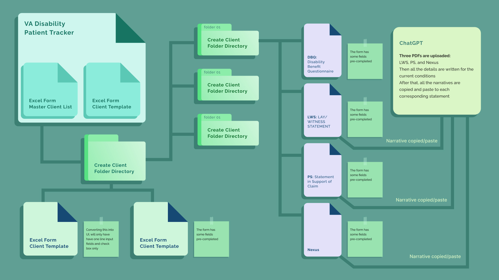
All the manual work process illustrated in a simplified graphic. As you can notice it involved many files and folders to access while completing a benefit application form.
My Role
I worked from a set of client requirements reviewed by the project manager. My tasks involved comprehending the manual doctor process, translating it into an automated user flow, and designing UI screens that maintained a functional flow. While working on the UI design, I addressed questions the requirements didn't answer. One of those questions reshaped the product's architecture.
One Patient Profile Instead of Split Screens
The client required to have a patient profile screen, an application document screen, and patient's disabilities screen. This replicated his spreadsheet manual workflow that grouped documents by type but didn't reflect the actual workflow. I proposed a single patient profile page, divided into three sections: patient details, general application forms, and disabilities. I organized disabilities into vertical tabs to easily access each corresponding application form.
Two principles guided the structure: documents should be grouped by hierarchy, not type. A doctor reviewing a case would find it easier to scan and memorize document locations in data-heavy patient profile.
Endless tabs without hierarchy caused cognitive fatigue and overloading. Suggesting scrolling for continuity and tabs for parallel access eased cognitive fatigue, and made navigating application forms fun and intuitive. The client welcomed the recommendations with a smile, also suggesting improvements to the app's side menu. These signals indicated the platform had a broader role than initially assumed.
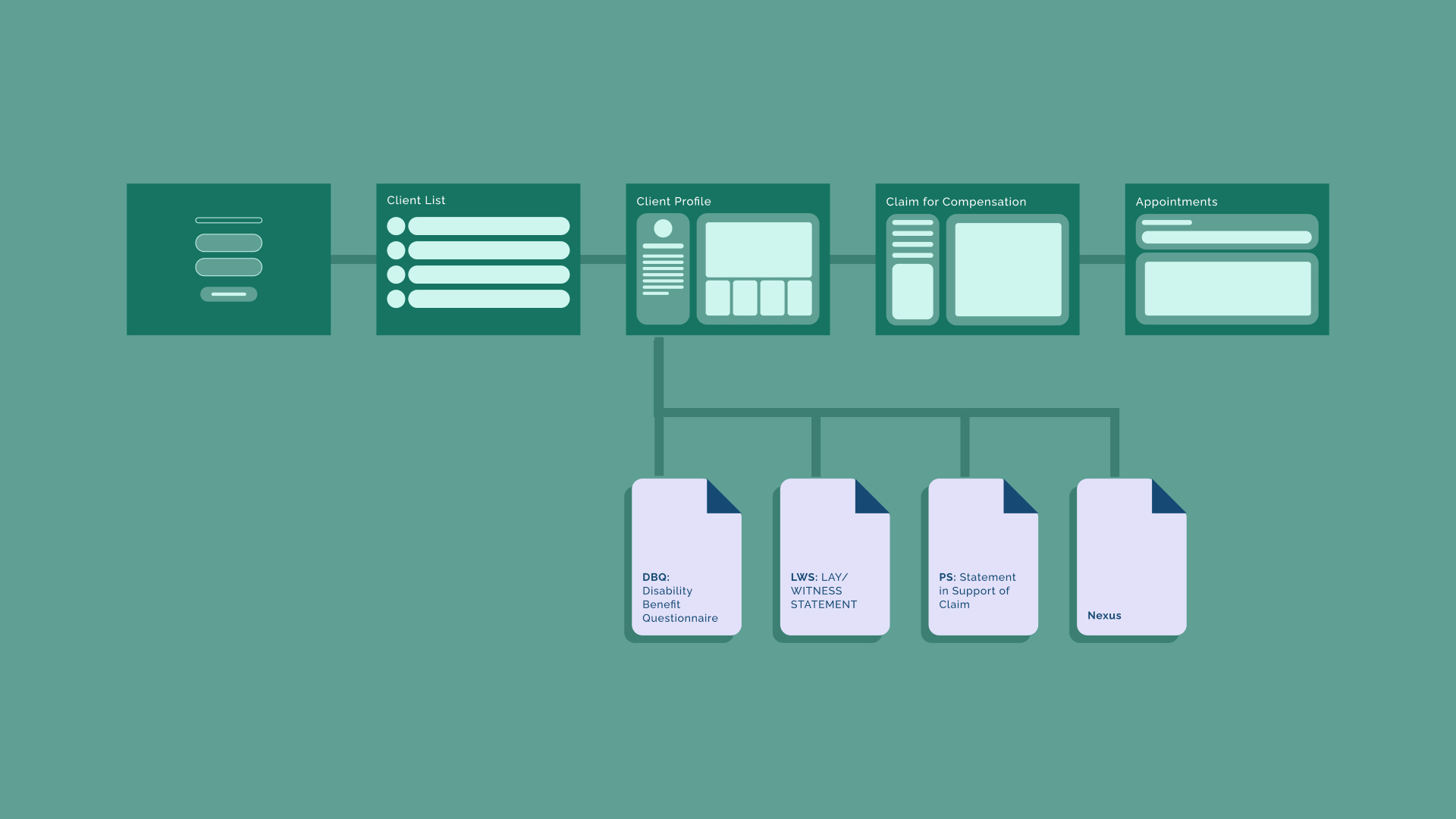
Endless tabs without hierarchy caused cognitive fatigue and overloading. Suggesting scrolling for continuity and tabs for parallel access eased cognitive fatigue, and made navigating application forms fun and intuitive. The client welcomed the recommendations with a smile, also suggesting improvements to the app's side menu. These signals indicated the platform had a broader role than initially assumed.
Working Inside the System
The platform functionality had a higher priority than the visual UI design. The time was limited, and was agreed to avoid creating custom UI elements. Instead of viewing the constraint as an obstacle, I saw it as an opportunity to demonstrate my design skills under pressure. Clarity comes from information hierarchy, structure, and flow, not from polished visuals.
The clients suggestions had to be followed as asked which included the document statuses as well. I had freedom on suggesting design solutions on structure and flow.
Where It Stands
The product is under development. The platform unite the whole workflow into one single system. All the processes of the applications are almost automated reducing the amount of empty input in the form.
The most important outcome isn't only the time saved. It's that the workflow is now transferable: a process that previously lived in one person's head can be handed to support staff. The practice can grow past its founder.
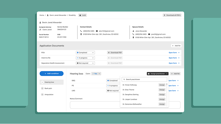
Patient disability screen which displays all the patients details.
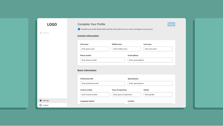
Practitioner sign up form that is completed when signing up
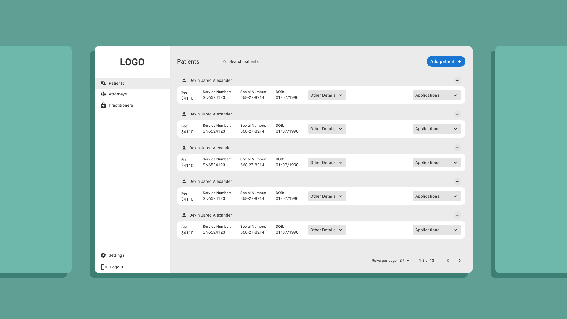
The patient list provide visible details for quick identification as the "Service Number" and other details hidden behind a drop button.
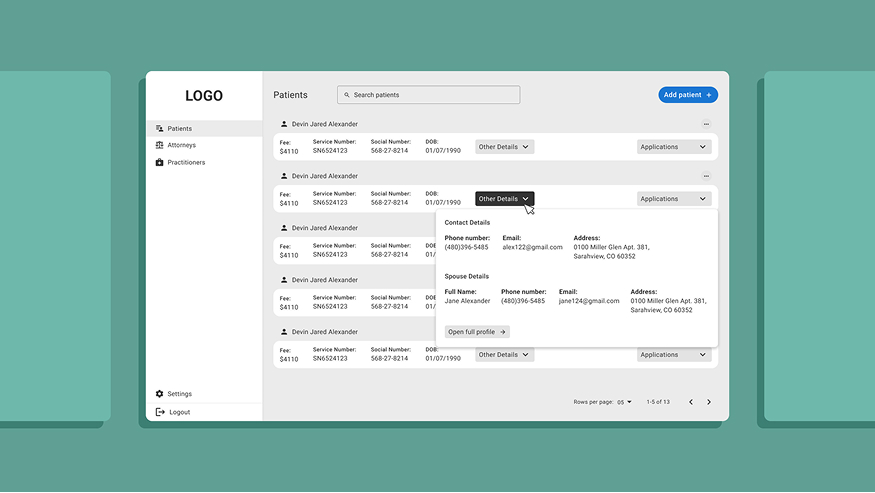
When you click "Other Details" you can see patient's other details which in help in the work flow.
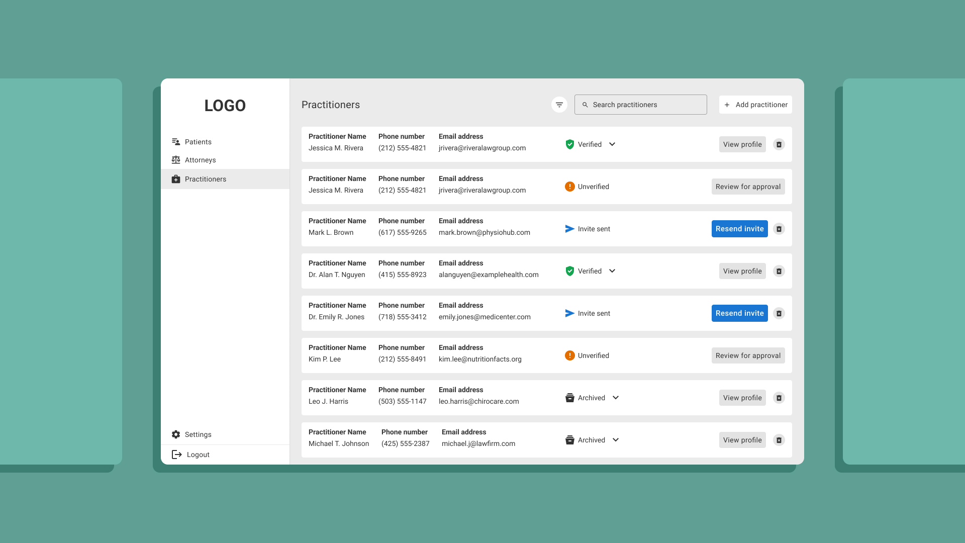
The practitioner list provides needed details and status for a better administration of the platform