Case study · Web platform · Healthcare benefits
Converting Spreadsheets to Automated Flow
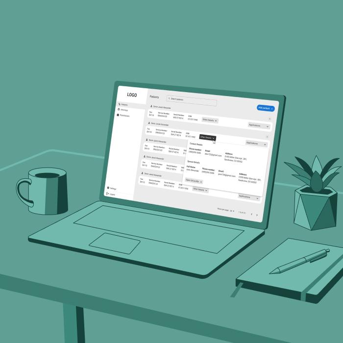
A medical practice ran benefit applications through endless Excel tabs and ChatGPT. I turned that manual process into one automated web platform, built around a single patient profile.
Role
Product designer (Contract)
Scope
Web application, UX architecture, user flow, visual UI design
Status
Under development
Constraints
Material UI components library
Team
Jeffrey Hanby, John West · Lookfar Labs
At a glance
Problem
A process only one person could run
Applications lived in endless Excel tabs and ChatGPT copy-paste. Every status update was manual, and the workflow was too personal to hand off.
What I did
One patient profile, organized by hierarchy
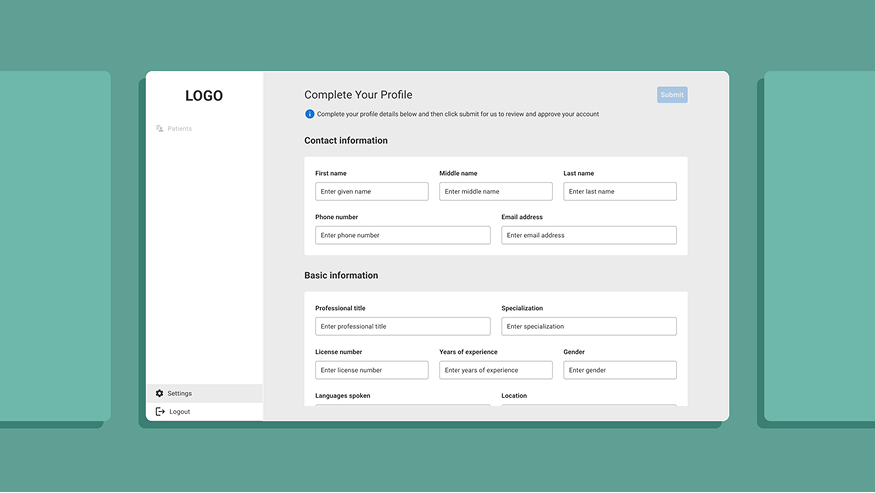
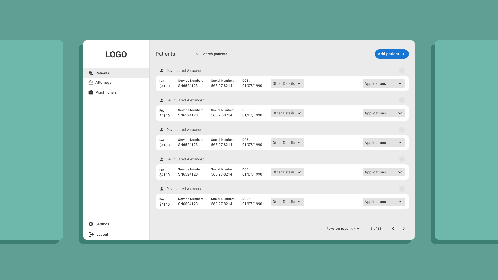
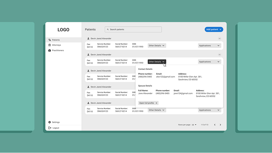
I translated the manual process into an automated user flow and replaced three split screens with a single profile, using Material UI only.
Outcome
A workflow the team can delegate
The whole process now lives in one system, with most of the application work automated so it can grow past its founder.
The problem
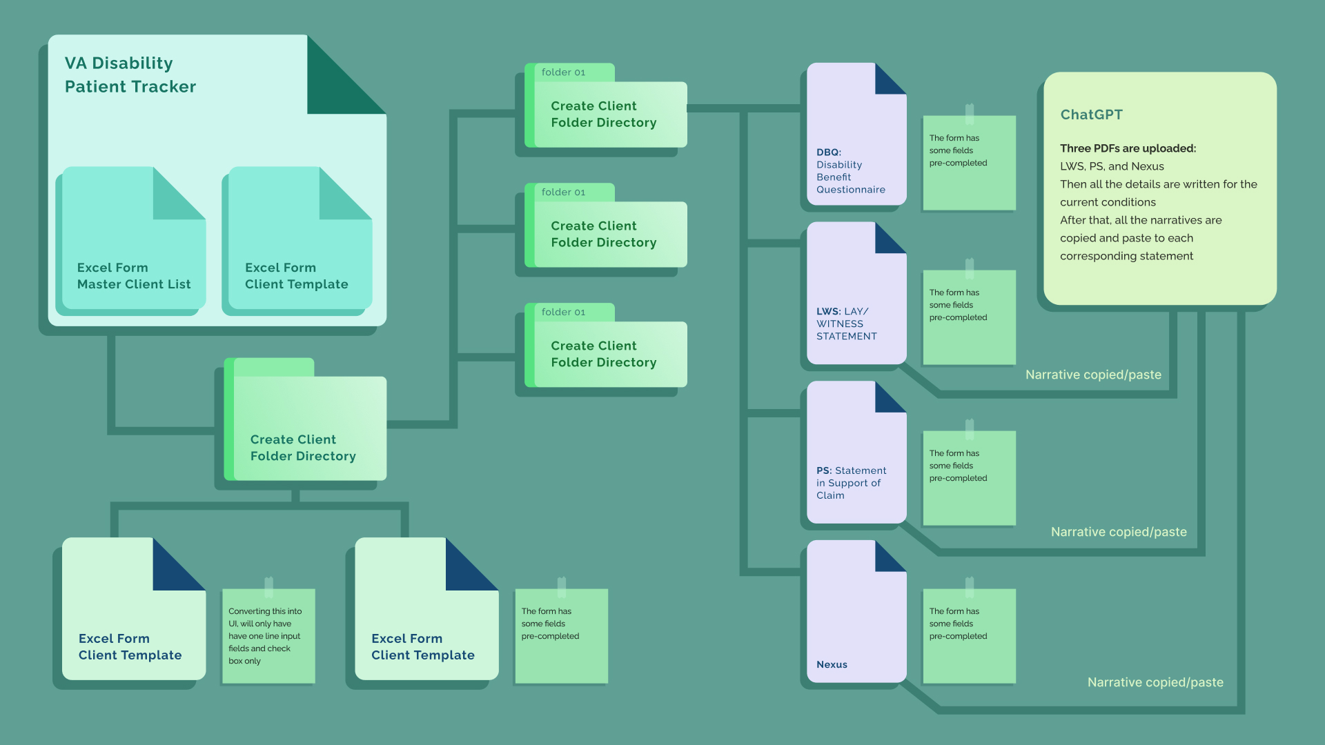
We create processes we believe make our job easier, but the complexity of the practice itself makes them time-consuming and hard to delegate. Our client’s manual practice mirrored a medical practice that filled out benefit applications for patients. It relied on endless Excel tabs for managing applications and ChatGPT to copy boilerplate content into each form.
Each application was a headache, requiring updates and progress status changes for every form. Scalability was another issue: the workflow’s complexity and personalisation made it hard to hand off to another team member.
My role
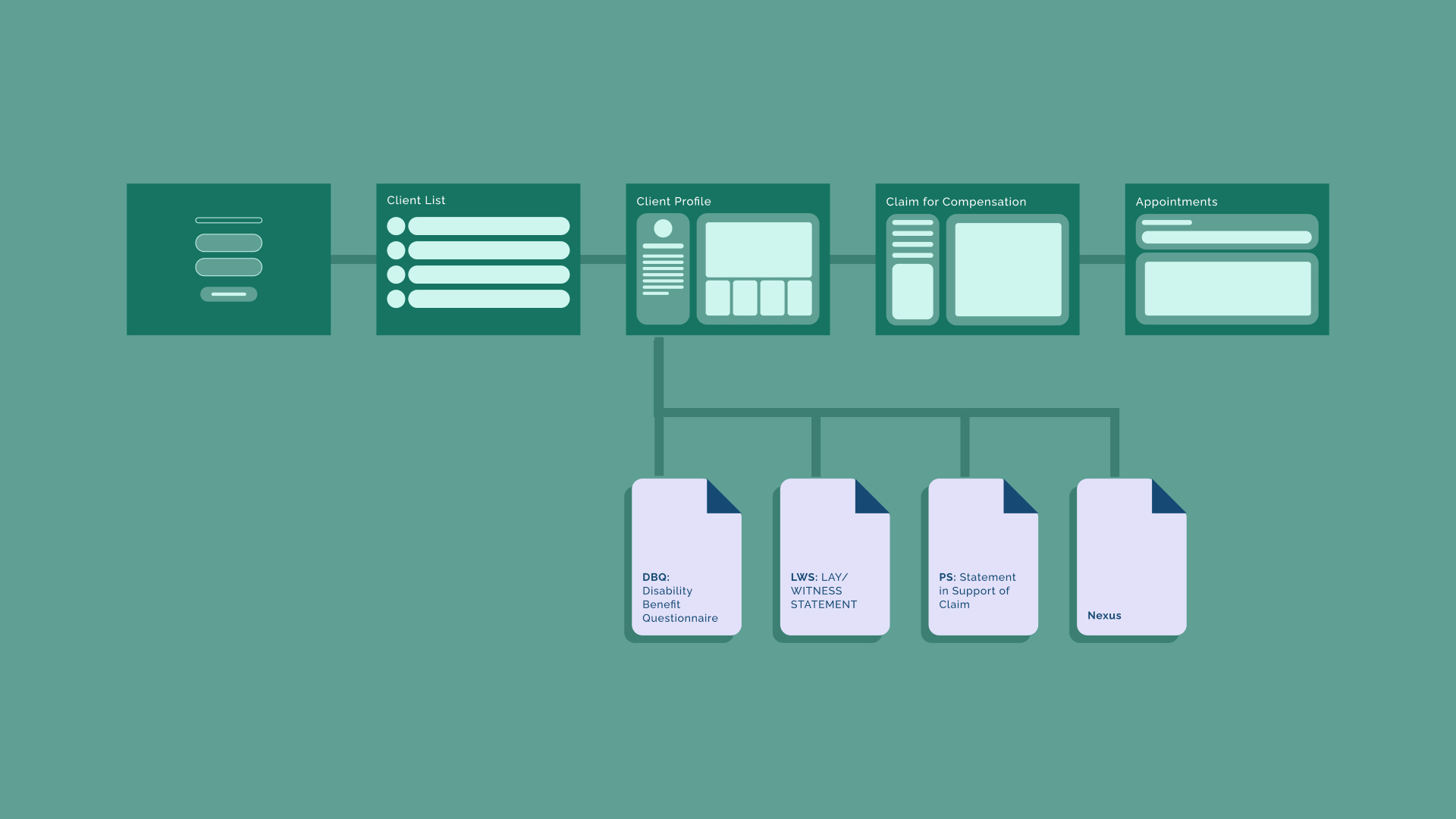
I worked from a set of client requirements reviewed by the project manager. My tasks were to understand the manual doctor process, translate it into an automated user flow, and design UI screens that kept a functional flow. While designing, I answered questions the requirements didn’t cover — and one of those questions reshaped the product’s architecture.
One patient profile instead of split screens
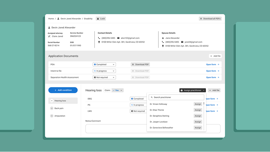
The client asked for a patient profile screen, an application document screen and a patient disabilities screen. This replicated his spreadsheet workflow, which grouped documents by type but didn’t reflect how the work actually happened. I proposed a single patient profile page in three sections: patient details, general application forms, and disabilities — with disabilities in vertical tabs for quick access to each application form.
Two principles guided the structure: group documents by hierarchy, not type; and make it easy for a doctor reviewing a case to scan and remember where documents live in a data-heavy profile.
Endless tabs without hierarchy caused cognitive fatigue and overload. Scrolling for continuity and tabs for parallel access eased that fatigue and made navigating application forms intuitive. The client welcomed the recommendations and even suggested improvements to the side menu — a sign the platform had a broader role than first assumed.
Working inside the system
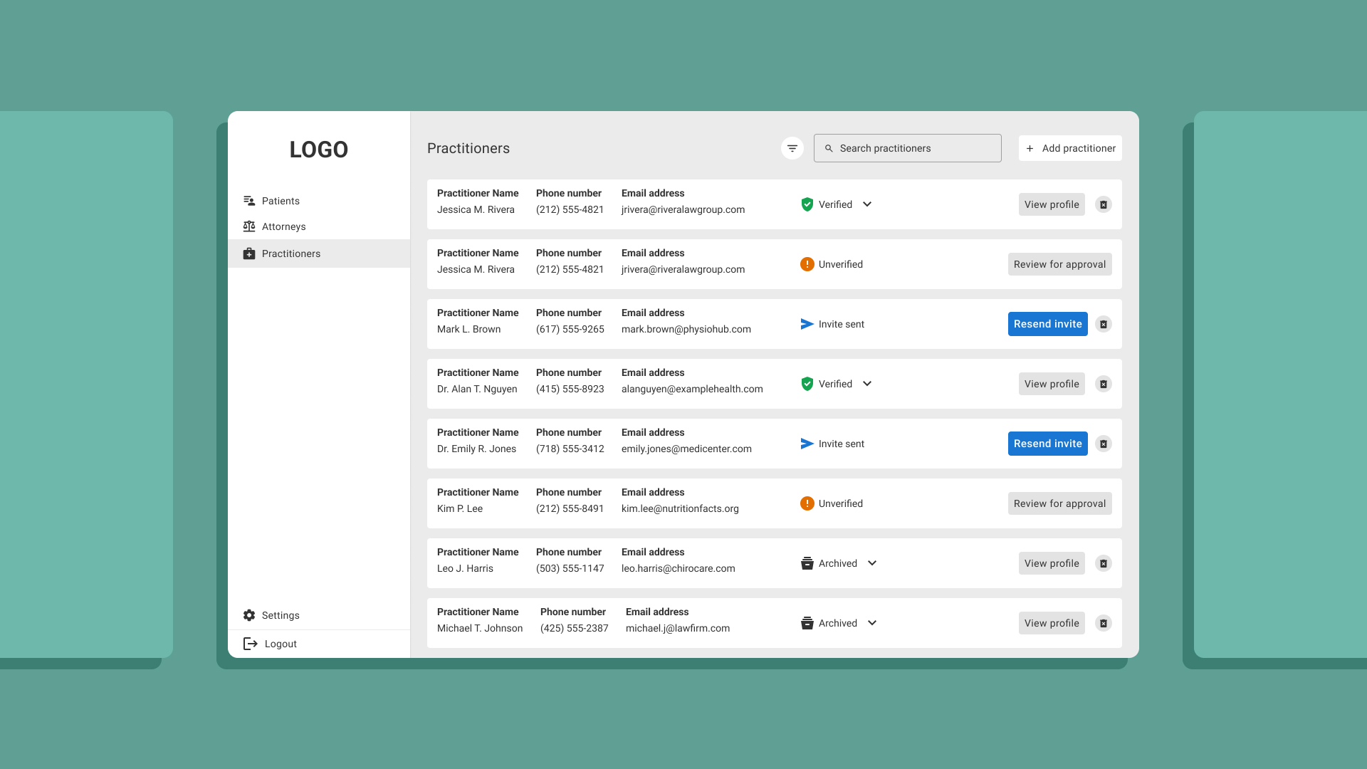
Platform functionality had a higher priority than visual polish. Time was limited, and we agreed to avoid custom UI elements. Instead of seeing that as an obstacle, I used it to show that clarity comes from information hierarchy, structure and flow — not from polished visuals.
The client’s requests, including the document statuses, had to be followed as specified. I had freedom to propose solutions for structure and flow.
Where it stands
The product is under development. The platform unites the whole workflow in one system, and most of the application process is automated, reducing empty inputs in each form.
The most important outcome isn’t only the time saved. The workflow is now transferable: a process that lived in one person’s head can be handed to support staff, so the practice can grow past its founder.
A guided flow for documenting car-wreck incidents →
Have a complex product that needs to feel simple?
Tell me about it. Full case studies are available on request.