User Interface and Interaction Design that create intimacy
Look, I've spent a long time designing and redesigning pretty much every UI element you can think of. Buttons that get clicked thousands of times a day, navigation systems that guide millions, dense dashboards that help people make million-dollar decisions, forms that collect life's most personal info. If it lives on a screen, I've probably worked over it at some point.
Every project eventually ends with the same uncomfortable question: Is this actually good? Does it feel right? We now have insane tools. Data layers, predictive UX models, even algorithms that nudge color choices down to the hex code. They help us craft flows that convert, retain, and perform. But in all that optimization, we've mostly ignored the one thing that keeps people coming back. How does the interface make someone feel seen, understood, maybe even delighted? How do we create that invisible thread, that visually and emotionally bond the product with the human?
Between the bussiness goals and users expectations, I have come to realize that three following layers, if balanced precisely, can help in building a strong bonding with people.
Designing for the gut: It is either good or bad
Designing for interacting:
Designing for interacting:
Tools
Some of the tools that I use to build intimacy through UI and interaction design:
My work
Visuals speak better than words. The following work samples are the results of my fun and creative design process
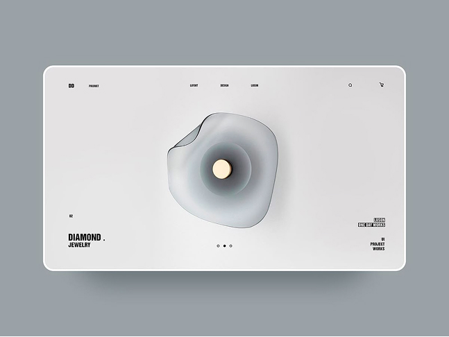
UI Design
UI Visual Design that Create Digital Intimacy and Experience
Years ago, I embarked on a journey of failures and trials with the goal of gaining knowledge. I discovered that design is not about being pretty, but about building connection and intimacy.
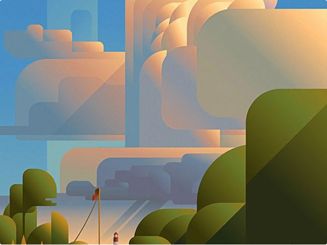
Illustration design
Yes, AI can design stunning illustrations but can they tell your story?
Visual art has always been in my heart. I enjoy drawing and crafting story-driven illustrations. Join me in exploring concepts, sketching ideas, and diving into colours and shapes to design the illustration of your story.